Main builder component. Can be configured for multiple objects using Custom Metadata Lightning Builder Type and metadata types related to it
objectName - API name of object
recordId - ID of record to display. Empty if new record is being created
datatablePlus
Enhanced datatable: contains new column types - selection button and picklist.
See lightning-datatable in Salesforce Lightning Web Components documentation for the most up-to-date specification.
Two column types were added: selectButton and picklist.
datatablePlusPaginated
The datatablePlus with added pagination features
keyField - key field of table
columns - list of columns to display
hideCheckboxColumn - if true no checkboxes will be displayed in each row
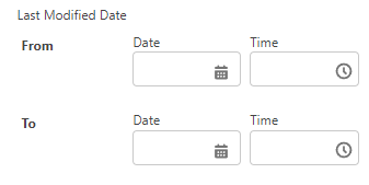
dateRangeInput
Input to define start and/or end date, used in filters
label - main label displayed at the top
labelFrom - used to override “from” label
labelTo - used to override “to” label
name - API name of field, used for communicating changes to the parent component
required - if true component is required
variant - use “label-hidden” to hide main label
isDateTime - if true date and time fields are shown
value - current value
disabled - if true component is disabled
dateUtils
N/A
Contains useful date-related functions
N/A
dynamicRelatedList
sObjectApiName - API name of object
numberOfRecords - number of records to display
sortedBy - API name of field to sort by
sortedDirection - ASC or DESC, order of sorting
rowActionHandler - custom function executed when action on row is executed by user
fields - API name of fields to query
columns - API name of column fields
allowNewRecord - If true New action is displayed on each row
allowRecordDelete - If true Delete action is displayed on each row
allowRecordEdit - If true Edit action is displayed on each row
showViewAll - If true “View All” button is displayed
customActions - set of custom actions
emptyTextInfo - message displayed when there are no results to show
filters
Allows developers to easily include filtering capabilities in their components. Filters component can be configured just by object name and API names of the fields - the rest will be automatically generated using SF’s schema (see CTL_Filters apex class).
The component can be used in one of two modes - active mode informs parent component on every change of the input (useful for super-responsive filtering in real time), passive mode can be used with modalWrapper and filtersButton to create a filters modal where user can apply/discard changes and clear all filters at once.
Since Apps 0.124 the component also allows prepopulation of filter value (for example when the developer wants to limit search results immediately on the page load) - pass simple object in the following format: {fieldApiName: 'value', fieldApiName2: 'value2'}
inputsInRow - number of columns in which inputs are displayed
hideHeader - if true, header slot is hidden
filters - configuration object, list of filter configurations. See CTL_Filters apex class for utility functions creating this parameter automatically based on object/fields API names
activeMode - if true component communicates every change via event. If false, getFilterValues function has to be used (it depends if you want to have “apply filters” button or not)
initFilterValues - put a simple object here with field values to prepopulate the filter inputs
Functions:
clearFilters - clear all values on the inputs
getFilterValues - get all values from filter inputs
discardDraftValues - (only for non-active mode) discard the changes that have been made on the filter inputs by user
applyDraftValues - (only for non-active mode) apply the changes that have been made on the filter inputs by user
lookup
Very flexible, deep-configurable component for displaying lookup input field. See lookupContainer for simpler version
variant - label-stacked, label-hidden or label-inline - controls where the label is displayed
label - label of the field
required - if true then the field is required
disabled - if true, input cannot be modified
placeholder - text displayed as placeholed
isMultiEntry - if true, user can select multiple entries
errors - list of string with error messages
scrollAfterNItems - either null or integer value that forces component to scroll the results after N number of items
newRecordOptions - options allowing user to create new records
minSearchTermLength - minimum number of characters required to perform a search
selection - element selected in the lookup (or array of elements when multi entry)
Functions:
setSearchResults - sets fixed search results
getSelection - gets element(s) selected in the input
setDefaultResults - sets the default search results
lookupContainer
Simplified version of lookup component. Main difference is
objectName - API name of object through which we are searching
searchFieldName - API name of the searchable field (usually Name)
name - API name of the field. Used in event informing parent component about value changes
label - Label of the input
placeholder - Placeholder text of the input
iconName - icon name (see SLDS icons) that will be displayed next to every lookup item
required - if true, input is required
isMultiEntry - if true, component will allow to select more than one element
whereClause - defines additional whereClause that will be applied to every record search
value - return semi-colon-separated values (id(s) of selected records)
Functions:
getSelection - returns selected values in format as in lookup component
modalWrapper
Simple modal window.
visible - if true, modal and its contents are displayed
title - header displayed at the top
disableScroll - if true, scrolling inside the modal is disabled
hideClose - if true, close button is closed
callcustomevent - if true, custom event is called on close click
Functions:
show - shows modal
hide - hides modal
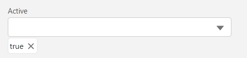
multipicklist
Displays more user-friendly version of multipicklist (than LWC standard one). Selected options are displayed as pills.
label - label displayed
name - name of the component (used to inform parent via event)
required - if true, field is required
variant - use label-hidden when you don’t want to display input label
options - list of options possible to choose
disabled - if true, component is ineditable
value - values selected, formatted as semi-colon-separated string
Functions:
clearTextField - clears input
forceSetValues - force sets the values provided, even if they are not available in the field as options
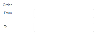
numberRangeInput
Displays two number fields allowing user to define range of the numbers. Used for filtering.
label - main label displayed at the top
labelFrom - used to override “from” label
labelTo - used to override “to” label
name - API name of field, used for communicating changes to the parent component
required - if true component is required
variant - use “label-hidden” to hide main label
value - current value
disabled - if true component is disabled
stringUtils
N/A
Contains functions for string-handling
N/A
universalInput
Polymorphic input - displays dynamically depending on the configuration.
fieldInfo - configuration object containing info about the field (see CTL_Filters.FieldInfo in apex for details)
hideLabel - if true, label won’t be displayed
Functions:
clearValue - clears input
utils
N/A
Set of universal functions.
N/A
JavaScript errors detected
Please note, these errors can depend on your browser setup.
If this problem persists, please contact our support.